[ad_1]
For beverage brands, tech companies and sports teams alike, logo redesigns are one of the best ways a brand can stay modern and relevant. And while it can attract positive press and generate sophisticated design discussions, it’s important to tread lightly in order to avoid a logo redesign disaster.
Just look at the backlash Penn State has been receiving since they launched their new logo in early August. Students and alumni even started a petition to redesign the logo, which reportedly cost $128,000 – yikes! Now that’s the kind of press you definitely want to avoid.

The good news is that many big brands have been very successful at updating their visual image in 2015. So many, in fact, that it’s hard to keep track of them all! So to make sure that you’re all caught up with the changes, here’s a quick roundup of our favorite logo redesigns of 2015 so far.
1) IHOP
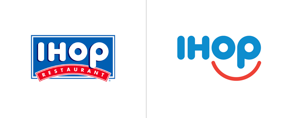
IHOP’s new logo boasts a clean, simple smile and a slightly updated color scheme. This is a big change from the previous logo – which actually seemed to portray a frowning face. This new look is much more welcoming and more aligned with IHOP’s brand mission as an affordable, family-friendly eatery.
2) LA Clippers
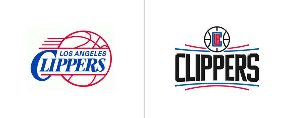
The Clippers’ new logo incorporates black text to make a bold statement, helping it reveal a competitive side against other big basketball teams. The name of the sports team takes center stage while the word Los Angeles becomes a subtle icon inside a minimalist basketball.
3) Spotify

By ditching the three-dimensional elements on the green Spotify circle, the music brand takes a much needed step into the 21st century. This new flat logo helps Spotify assume a more flexible brand identity, making it easier to change colors in order to appeal to different audiences and music types within the app.
Read: Should Your Brand Identity Be More Responsive
4) MINI
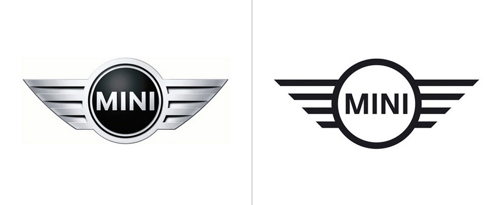
This redesign is a bold move for a global auto brand. Again, the three-dimensional logo is swapped out for flat design. This versatile logo translates well on all types of apparel and merchandise, so don’t be surprised when other big car brands follow suit.
Read: The Best Logo Design Trends of 2015
5) Coors Light
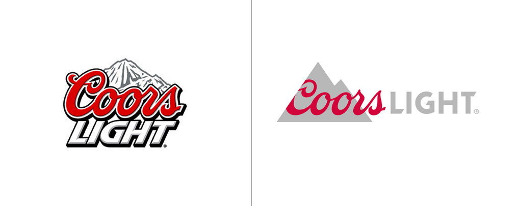
As one of the best-selling beers in America, Coors light was taking a big leap with this redesign. Luckily, their elegant new look helps them stand out from other big beer brand competitors. It also retains their historic mountain symbol and cursive writing while adopting flat design that appeals to the millennial generation.
6) OpenTable
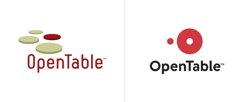
OpenTable’s new logo is part of a company-wide rebrand that better supports their brand mission. The new logo strips away shadows and bevels for a more flexible identity, which helps represent the community that’s cultivated around the dining out.
*Read: How OpenTable Powered Their Rebrand*
7) Cleveland Browns
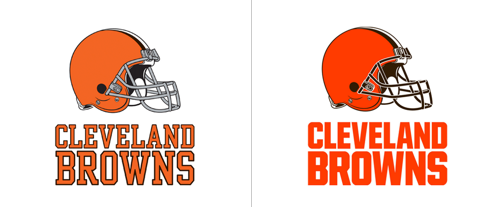
A brighter orange and bigger lettering helps the Browns’ new logo make a loud statement. While the football helmet looks similar in size and shape, the simple difference between black and gray color accents make a big, bold difference and are better suited for a successful modern sports team.
8) Dr Bronner’s
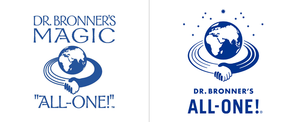
Dr. Bronner’s is definitely one of those brands that your parents used when they were kids, but that doesn’t mean their visual brand has to reflect their age. Having a logo with less text helps this heritage brand fit in on the shelf alongside other more contemporary products.
Read: LUSH Cosmetics: How a Brand Balances Ethics with Profit
9) Honest Tea
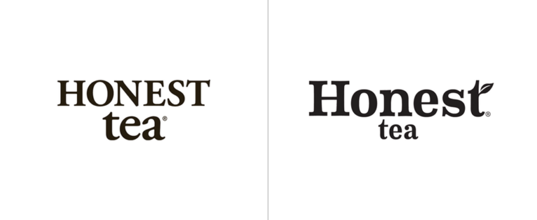
This is perhaps the most subtle redesign on this list, but that doesn’t mean it’s not effective. Honest tea’s new logo is a great example of how a few subtle changes to text can help a brand stay relevant. The leaf on the letter “t” helps make the logo become more recognizable when it appears on its own.
10) Southern Comfort
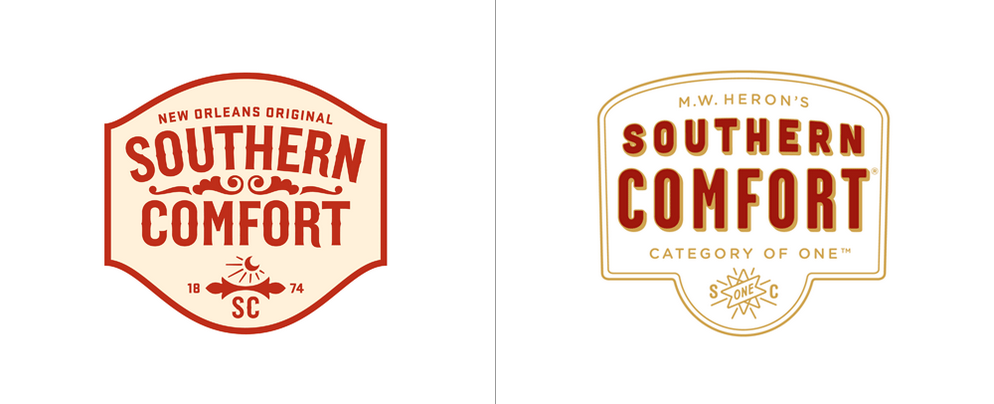
Southern Comfort’s rebrand incorporates the trendy, minimal logo design that is becoming more popular among other spirits brands. However, this whiskey brand differentiates itself by boasting their new identity tagline “category of one.”
*all photos courtesy of the UnderConsideration Brand New Blog.
Source link