[ad_1]
Text by Kazumasa Nagai, 1974
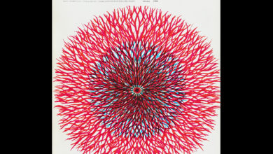
Quarterly Design was a Japanese publication. Fifty years on, it really captures and conveys the spirit of its time. It shares a lot in common with the renowned and still in print publication IDEA although only in Japanese and broader in terms of design, covering other disciplines such as architecture and interior design. Highlights of Issue 7 from the autumn of 1974 includes the striking cover by Toshihiro Katayama, and an incredible feature on the logos of Kamekura. As with many design publications of its time, this one mixes full colour images with black and white, and both uncoated and coated papers. The following is a translation of the article “Gorgeous and Delicate” written by Kazumasa Nagai on the work on Yusaku Kamekura, and was printed alongside 27 of his logos. For more graphic design history, click here.

There is probably no one who will argue that Yusaku Kamekura is a master of mark-making. I think that this is because Kamekura’s constitution as a graphic designer is perfect for mark-making. Any designer who has designed a mark will feel this, that an excellent mark looks simple yet packed with potential. That is extremely difficult.
It is just like a Columbus egg. It seems like it could be done as soon as you see the finished product. If you look at the official mark of the Tokyo Olympics, for example, the elements of its composition are only that of a red circle that is the sun and the Hinomaru, the Olympic mark and the letters TOKYO 1964. At first glance, it seems easy to do, but I think that this is a mark that can only be done by Kamekura. In addition, the Yamagiwa Electric mark is a light that is viewed from the front as organised radiation, and is summarised in a beautiful curve reminiscent of the softness of electric light, but this mark, which is dignified, sharp and familiar, is also Kamekura.

Kamekura has a keen intuition and discovers the essence of things. The essence of things are surprisingly simple and commonplace but a mediocre designer overlooks these and the result appears as an arbitrary interpretation seen through tinted glasses. Even if you find the essence of a thing, you will be exhausted without being able to boil down the natural thing as a mark supported by ideas. Kamekura can do that only because he has extraordinary intuition and modelling power. Even if you say intuition and modelling power, you can’t make a mark just because you have a good sense. It must contain the ideas and philosophy of a company, and for society to be included. It is none other than having excellent insight as a thinker that Kamekura makes so many excellent marks, and that he seems to be one of the best in the world. And what I would like to pay more attention to is that even if Kamekura makes one mark, he does not just end it as one mark, but how to use and develop the mark later, that is, the design policy and identity centred around a mark. Even if it is a unique and interesting mark that is well thought out in advance, marks can be difficult to use later. However, Kamekura’s mark is decided no matter where he goes. You can see this in development of the Tokyo Olympics mark and in the posters and other items of the World Design Conference (ICSID). At the World Design Conference venue held in Kyoto last year, the Kamekura symbol mark is at a key point and it gives a sense of unity to the whole venue, and seeing that it is visually exciting, and a testament to Kamekura’s ability.

I was reminded again, and the fact that this is due to Kamekura’s careful consideration, is that this mark has a basic form and is considered a changing mark, that the surrounding circles increase as the solidarity of design spreads throughout the world. But I understand well. Moreover, the uninflected word and the widened one have the same image, and the effect is magnified by the flow of the uninflected word. And it is heartbreaking to see it come to fruition on white and black posters.
As for Kamekura, the bigger the work, the more masculine the qualities, the more focused Kamekura is on a fighting spirit. So, even if you make a mistake in a small job, you will never fail on a big job. Skip the stunning out-of-the-field home run that makes you feel good. Creating a mark is one of the biggest tasks in graphic design. It is no wonder that Kamekura makes designing marks one of his strongest points. However, if it is misunderstood here, it is easy to think that being “masculine is masculine”, Kamekura’s masculinity in design production is all about the essence of things. It is all about eliminating waste and making it a powerful relic, and the finishing touches are surprisingly delicate. Although Kamekura’s arrogance is there, the delicate humanity of the nerves remains on the other side, and looking at these marks, it seems that it is Kamekura Yusaku itself.

Source link


