[ad_1]
Flat design ruled in 2014. We saw major brands like Fandango and Southwest switching out three-dimensional designs for bold, flat fonts. And with the undeniable success of these new logos, its evident that minimalist sensibilities like flat design will continue being popular in the years ahead. If you’re thinking about jumping on the minimalist bandwagon, here’s some more insight and information to help guide your decision.

First, Let’s Define Minimalist Design
Truly embodying the “less is more” aesthetic, minimalist design puts fundamental elements like balance, form, and shape at center stage. The minimalist design movement is rooted in modern architecture and interior design philosophies, which focus on stripping back ornate elements to encourage a more simple and peaceful lifestyle.
The minimalist principle translates into digital design, where simplified elements help provide a more user-friendly experience. Many brands have incorporated minimalist elements into their web design because it provides a higher level of engagement. Without the distraction of drop shadows and 3D elements, information is easy to consume and overall functionality increases.
A Few Examples of Minimalist Design
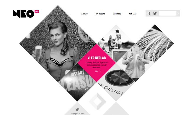
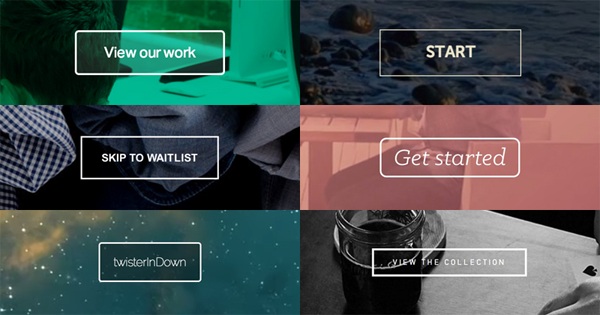
One of the hallmarks of minimalist design is the ghost button. These buttons typically have thin lines and transparent backgrounds that emphasize the large header images and videos that accompany minimalist design. Ghost buttons have high “call to action” response rates because they stand out and grab attention against uncluttered backgrounds.
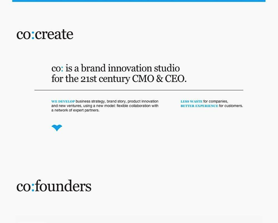
The Co Collective agency website is another great example. Here, they focus on words to drive the viewer’s interest, with a subtle color palette and sparse usage of geometric elements.
Next, Let’s Explore Flat Design
The days of heavy drop shadows and harsh gradients are far behind us, and this year’s most popular design trend will continue to be all about minimal type, bold colors and elegant photography and video. Flat design steers away from the textures and fine details that give designs a three-dimensional illusion, infusing graphic elements with simplicity instead.
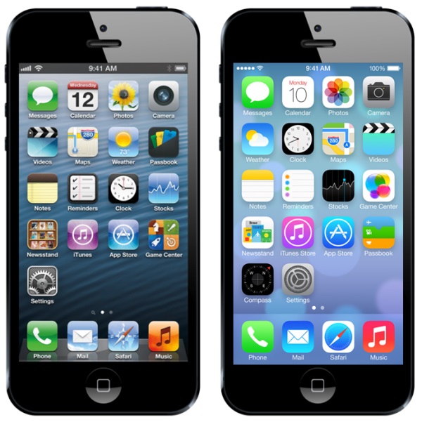
Flat design responds well to the dynamic screen sizes of tablets and cell phones, ensuring that copy is emphasized and readable across all platforms. For example, Apple’s iOS 7 debuted with bright colors, one-dimensional fonts and limited shadows both on the home screen and within apps.
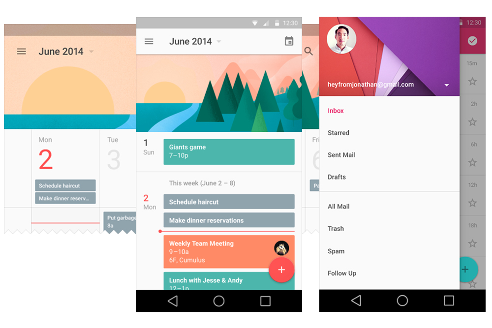
The Last Piece: Material Design
First developed by Google, material design echoes the “less is more” philosophy that has made the minimalist movement so popular. This design language applies the principal elements of print design—large typography, bright, deliberate colors and systematic motion—to digital spaces. As seen in this example of Google’s Android app, material design uses bold graphics and responsive animations to immerse the user in the experience.
So, Is Minimalism Right for Your Brand?
There’s no doubt that minimalist design is gaining traction, but there are a few things to consider before you incorporate it into your brand.
-It’s Hard/Risky
First, minimalism can be much more difficult to master, because you have to make the right choices about which elements will be eliminated while still conveying your brand personality. It’s important to know what tactics and experiences your target audience like and respond to, otherwise you might remove a critical piece of your brand as you simplify things.
-
It Might Not Make Your Brand More Visible Minimalism is a trend that has, in part, risen to popularity because it works better on mobile devices. At the same time, Mashable pointed out that trends can produce monotony in a space. Your branding mission is to create a distinctive look and experience that stands out from competitors on the web, on shelf space, and wherever else your brand exists. If you are going to apply principles from any trend, find a unique way to do so that stays true to your brand.
-
It Can Be a Big Change
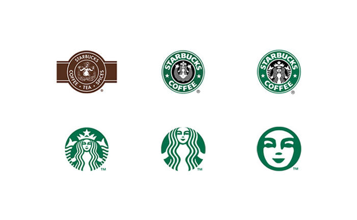
Another thing to consider is change. Users generally don’t like it. This is especially true if your current brand assets have been in place for a significant period of time. If you want to pursue minimalist design and it’s a major departure from your current aesthetic, consider making the change gradually with a method known as progressive reduction, where a user interface or logo is dynamically simplified over time.
As seen in this hypothetical study of the Starbucks brand, a logo that gradually changes in small ways can give the user more time to adjust and feel comfortable with the new look.
Source link