[ad_1]
Branding gone wrong can cost a business big time. The brand can lose fans, weaken its advantage in the marketplace or even become subject to legal issues. All of this can cost the business millions or more.
Here are 5 examples of brands that made pricey mishaps, as well as tips on how your brand can avoid making a million dollar mistake.

1. Fubu’s $6 Million Belly Flop
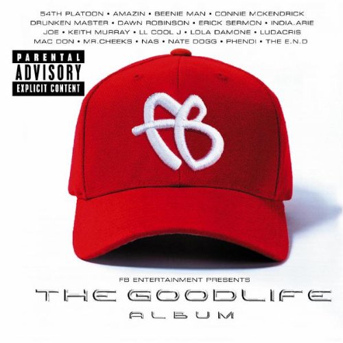
Daymond John, founder of the clothing company Fubu, made a common branding mistake when he decided to expand Fubu and start a record label. He hired some friends and jumped into the project without researching the brand’s customer base or the market.
In 2001, Fubu released “The Good Life,” a rap compilation featuring artists like Nate Dogg, Nas, Ludacris, and L.L. Cool J. Despite the big names, Fubu’s move to music was a $6 million bust.
John told Inc., “I blew $6 million because I did not hire or strategically align myself with anybody who knew anything about music.” And in an interview with Fast Company he also said, “We didn’t know the numbers, we didn’t look at our numbers, we were spending money like drunken sailors, we were getting caught up. Did we get exposure? Yes, but from the business model, we died.”
Lesson: If you’re thinking of expanding your brand, investigate the reasons why. Does it align with your brand’s vision and mission? And, more importantly, is this something your customers even want from you?
If the expansion makes sense, by all means, do it. Just make sure you build a team of experts who can navigate your brand through the uncharted waters.
2. Gap’s $100 Million Rebranding Blunder
![]()
In late 2010, Gap launched a company-wide rebrand, including a new logo. This move came without warning and consumers were not happy to see the brand’s 20-year old logo disappear overnight.
It turned out, the new logo was the product of a crowdsourcing project Gap had launched as part of their company rebranding and both the design community and Gap fans were outraged.
What began as a small buzz of complaints turned into a full-fledged campaign to revert back to the old logo. Gap responded swiftly with what could be the fastest turnaround in history — just six days after the new logo was revealed, the company went back to their old logo.
Read: 4 Things to Consider Before You Rebrand
It’s estimated that the entire debacle cost Gap a staggering $100 million, which is quite a hefty price tag for a logo that looked like it could have been designed in PowerPoint.
Lesson: Crowdsourcing critical design elements, especially anything to do with rebranding, is rarely a good idea. Professional designers know how to strategically rebrand a company without compromising the brand’s distinctive assets.
And if your rebrand is a disaster, don’t be afraid to take a lesson from Gap and retreat!
3. Pepsi’s $1 Million Logo Letdown
![]()
Poor Pepsi, despite numerous attempts, it hasn’t quite managed to capture the timeless identity of Coca Cola (cue a Pepsi Vs. Coke debate). One of the more notable times Pepsi tried to reinvent itself was the 2008 launch of a new logo design from the Arnell group.
The new version of Pepsi’s logo rotated the circular icon and attempted to turn the white wavy stripe into a smile. The result left consumers with less than a sweet taste in their mouths.
Forbes wrote, “The white stripe on the new logo varies across Pepsi products, getting wider or thinner depending on the product. The design team that spearheaded the campaign explains that they’re supposed to be ‘smiles,’ but we don’t really see it.”
According to CBS news, Pepsi paid Arnell $1 million for the new logo which O’Dwyer’s PR blog said looked just like the Obama campaign logo. The brand may have tried to jump on the minimalist bandwagon, but the end result was inconsistent across packaging, eerily reminiscent of other logos, and left the consumer truly confused.
*Read: Your Brand Isn’t Unique — But is it Distinct? *
In the end, this logo reportedly cost Pepsi $1 million, not including the cost of rebranding every can, truck, letterhead and brand asset across the globe.
Lesson: Instead of redesigning the core elements of Pepsi’s iconic logo, the company would have been better off ditching the typography and just sticking to the circular icon fans of the brand know and love. Sometimes less truly is more.
4. Radio Shack’s $200 Million Tragic Tagline
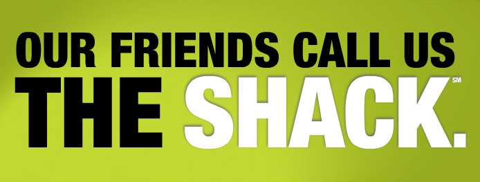
In August 2009 Radio Shack changed its name to “The Shack” and completely shed its identity as the go-to electronics store for tinkerers. Instead of focusing on what made the brand so great in the first place, Radio Shack tried too hard to become something else altogether.
Radio Shack spent a reported $200 million on the rebranding project, including television and digital ads featuring a cringeworthy tagline, “Our friends call us The Shack.”
“The Shack” and its new, modern look ultimately turned off the company’s core customers and failed to attract any new ones. Plus, as Joshua Topolsky from Engadget said, “They wanted us to immediately picture a remote location where very, very bad things happen.”
Lesson: We’ve talked about it on the Brandfolder blog before, but brands that learn to embrace their inner geek end up building brand loyalty. Learn what makes your core audience tick and give them a safe place to totally geek out.
Don’t try to be part of the cool kid’s club – just be yourself. Your fans will love you for it.
5. Guess’ $4.7 Million Counterfeiting Case
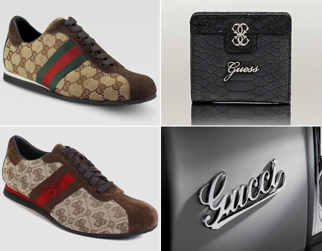
In the spring of 2013, clothing retailer Guess lost a 4-year legal battle against Gucci over a trademark dispute. Gucci alleged that Guess had duplicated Gucci’s logo on a line of shoes and accused the brand of counterfeiting, unfair competition, and trademark infringement.
Read: Should Your Brand Identity Be More Responsive?
The lawsuit was filed in both New York and Milan, with the courts siding with Gucci in the New York case and the courts siding with Guess in the Milan case. The New York court ordered Guess to pay Gucci $4.7 million in damages for Guess’ breach of its signatures, but the amount was later reduced to just over $450,000.
In contrast, the Milan courts ordered Gucci to cancel several of the brand’s iconic patterns, including the “G” stamp.
Lesson: Neither brand really won in this case. It’s hard to say which came first, the chicken or the egg, but copying another brand’s work or relying too heavily on “inspiration” won’t do your own brand any favors.
The purpose of your logo is to represent your business and build brand recognition. If it looks too similar to another, it has failed.
Morgan Quinn is a recovering lifestyle blogger and the Digital Content Manager for Brandfolder, a simple and easy tool for managing digital brand assets. She has created content for brands like Mint.com, Quicken, Ugg Australia, and Martha Stewart. She threw in the towel on Twitter, so follow her on LinkedIn instead.
Source link