[ad_1]
When the NFL started in 1920, there were only 11 teams, the league was known as the American Professional Football Association, being a pro football player was less lucrative than being a blue collar worker, and some of the earlier NFL logos looked like this:
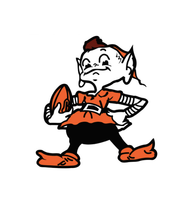
CLEVELAND BROWNS (1959 – 1969)

Today, we stand at 32 teams across the country, the NFL is the most popular professional league in America, yearly revenue sits just over a hefty $9 billion dollars, and NFL logos look like this:
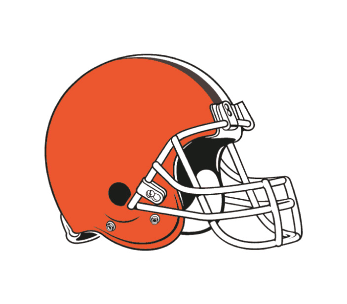
CLEVELAND BROWNS (2015 – present)
Hold on a minute!
This massive machine of sportsmanship and fanaticism has logos that are football helmets?
Yep, and that’s after even a recent rebranding (sorry, Browns fans).
But wait, we’re here to talk about the good NFL logos.
I know, “good,” especially when it comes to design, can be a pretty subjective thing. Luckily, we have design-savvy folks at Brandfolder who have written extensively about design and logo trends. With their expert input, this list of top NFL logos by division was born.
Here’s how it works:
- Like a regular football season, each NFL team competes against others in their division. There can only be one division champion.
- NFL logos are measured by:
- How technically-sound and modern the design is
- The relevancy to the brand
- References the heritage of the team or team’s city
- The best and worst divisions are called out. We even picked out the two top logos to face off in a hypothetical NFL Logo Super Bowl.
AFC EAST WINNER: New England Patriots (2000 – present)
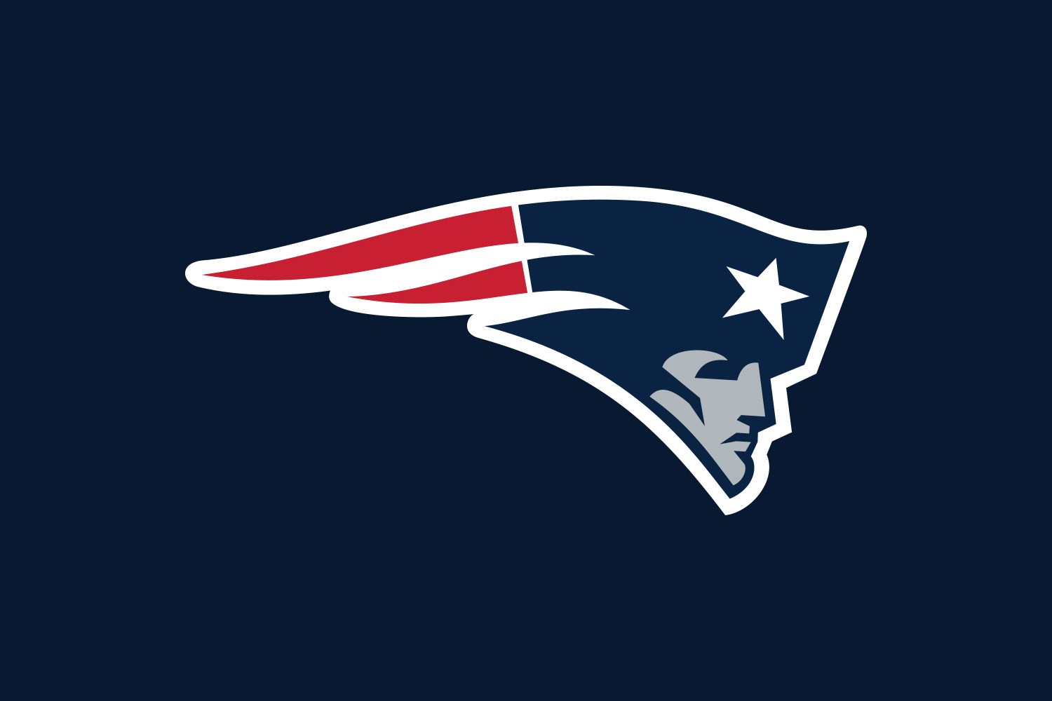
Hate on the Pats and call them cheaters all you want but the New England team is within regulations when it comes to their logo. It’s not easy to incorporate red, white, blue, and a star in a design while keeping it unique. Negative space is used on the left of the logo to make this graphic seem like it’s charging onward towards football freedom.
AFC WEST WINNER: Denver Broncos (1997 – present)
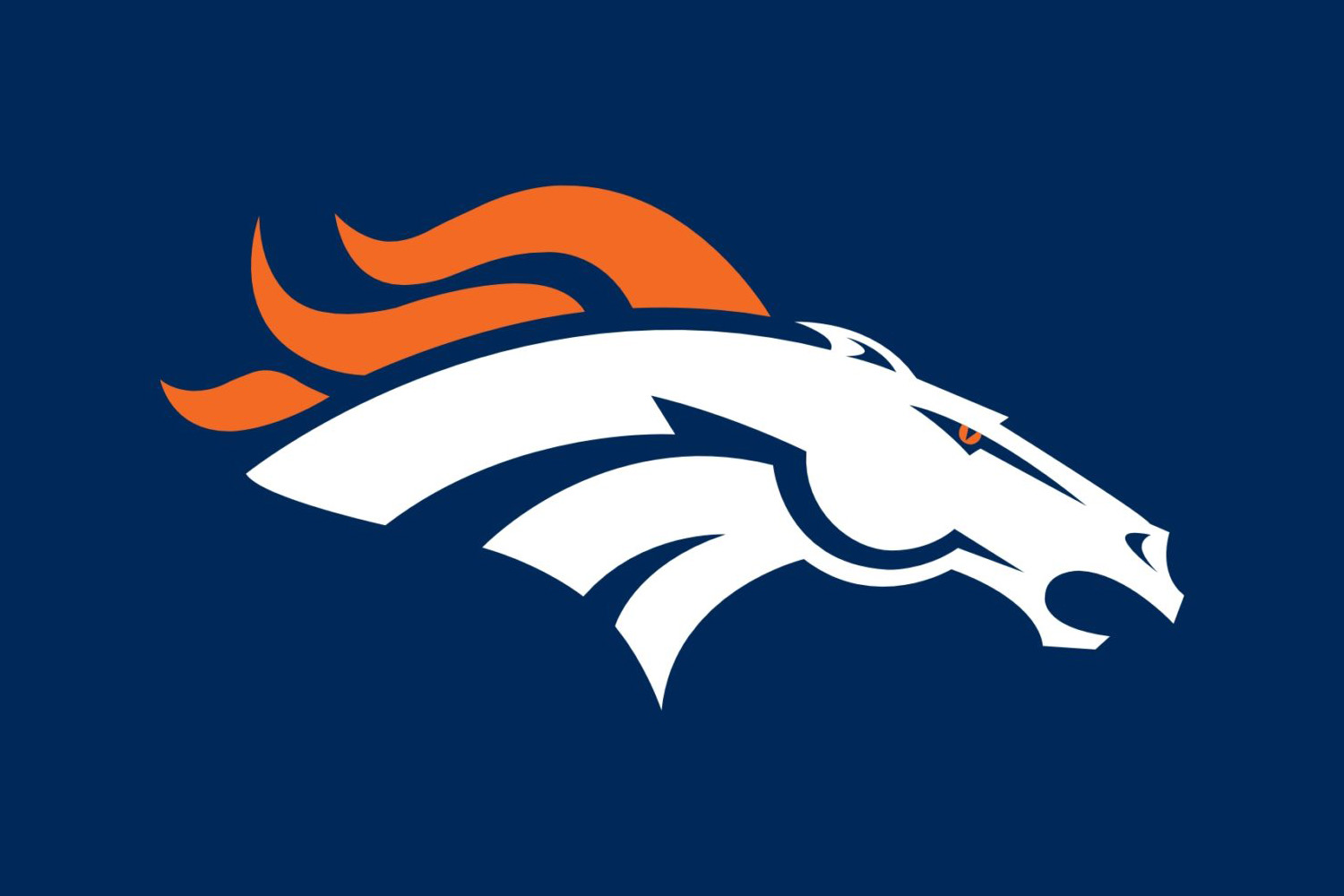
You might think the Broncos won because we’re a Denver-based company. But look at this logo and tell me you can’t feel the wind whipping through the fiery mane of this majestic steed? The aggressive facial features balance out the easy-going lines of the mane and rounded top line of the Bronco for a logo that feels grounded and free-spirited at the same time.
AFC NORTH WINNER: Pittsburgh Steelers (2002 – present)
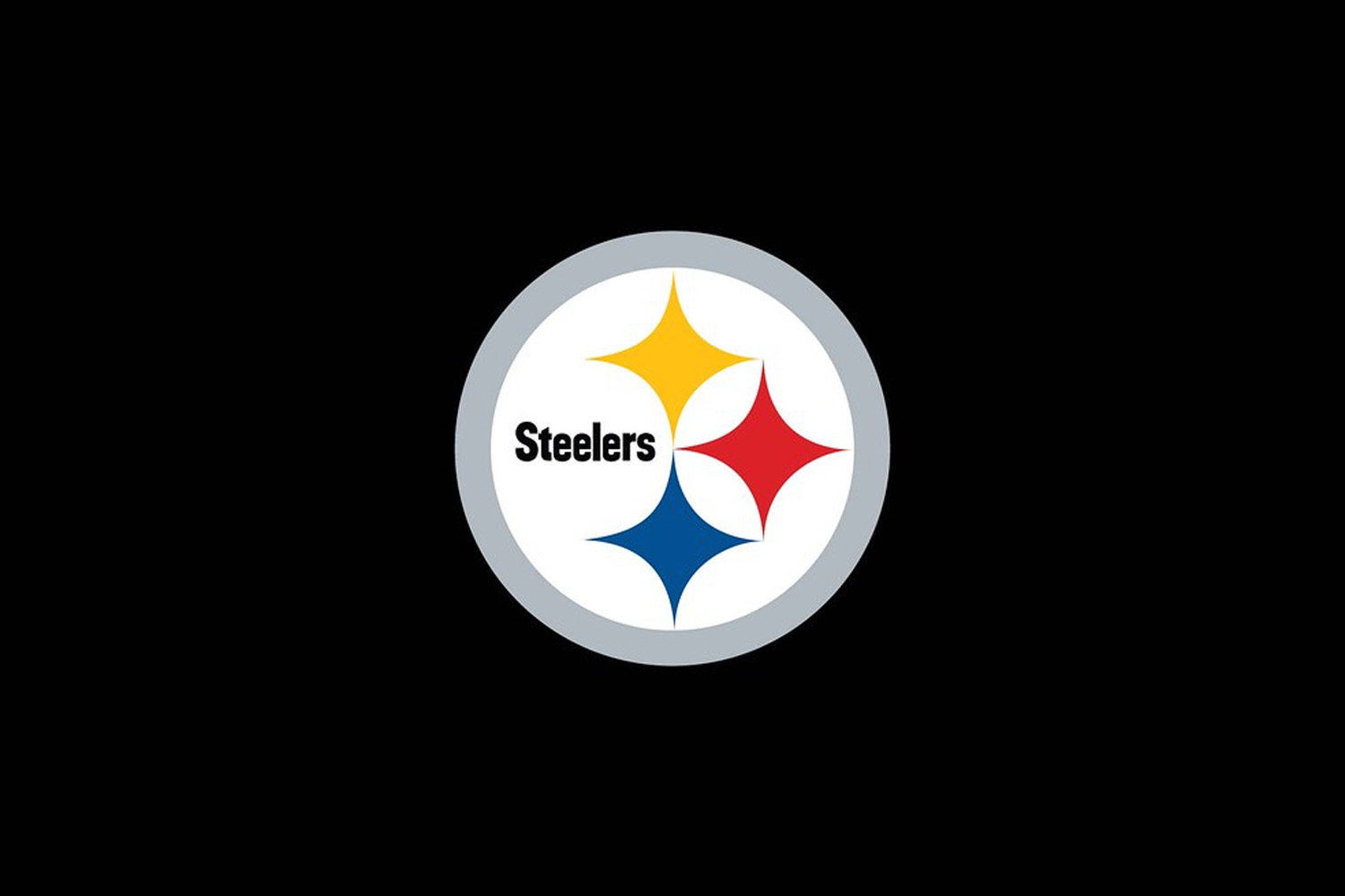
Confession time: I used to be a Steelers fan. But I took my old bias out of the picture and did my best to evaluate the AFC North group as objectively as possible. The Steelers logo does a great job of paying homage to the heritage of Pittsburgh by incorporating the U.S. Steel logo (it is the Steel City, after all). The interplay of the three diamond shapes makes this sports logo as classic as they come.
AFC SOUTH WINNER: Houston Texans (2002 – present)
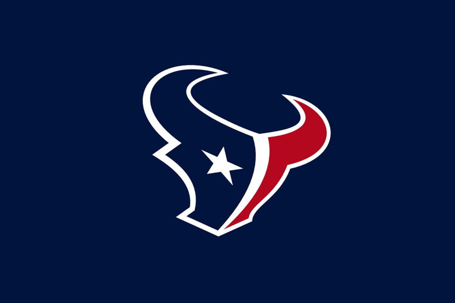
Again, here’s a logo that feels fresh, modern, and fierce while using the classic red, white, and blue combo. Whereas the Patriots logo used the white star as an add-on to the brim of the Patriot’s hat, the Texans feature it as the bold eye on the Longhorn. The curvature of the entire animal makes it feel like it’s rearing its head back, about to charge right off the screen. Bonus points for using negative space to create a strong “T” shape in the middle of the Houston Texans logo.
AFC SOUTH RUNNER-UP: Tennessee Titans (1999 – present)
Can we just call this the good blazing emblem of the South and call it a day? The strong pick-like “T” anchors the logo. The usage of red as an accent color in the three stars and trailing flames contrasts against the blue hues to make the shadowed “T” pop.
NFC EAST WINNER: Philadelphia Eagles (1996 – present)
The Philadelphia Eagles may not have the most thought-provoking logo, but it beat out the rest of the NFC East by a mile. The grey adds dimension and motion while the Eagles green outlines and brings together the whole logo. The four-color combo highlights the strength of this bird of prey, making it look like it’s about to swoop down and attack the gridiron.
NFC WEST WINNER: Seattle Seahawks (2012 – present)
It was just last year that the Native mask that inspired the Seahawks current logo was in display in Seattle. The strong beak and brow lines play with the intricate, sweeping strokes at the back of the face to create a fierce and tribal-like aesthetic. The forward lean of the logo mimics the feeling of movement, while the green eye is the finishing touch that makes other logos in envious.
NFC WEST RUNNER-UP: St. Louis Rams (2000 – present)
The St. Louis Rams logo uses the complimentary colors of navy, tan, and white for a grounded graphic. It achieves balance with curves and sharp angles, while the stacking of the three colors on the front of the ramming animal focuses the eye. Tilt your head slightly to the right and you’ll notice the near snarl of the ram, as if it’s just about to make contact with its opponent.
NFC NORTH WINNER: Minnesota Vikings (2013 – present)
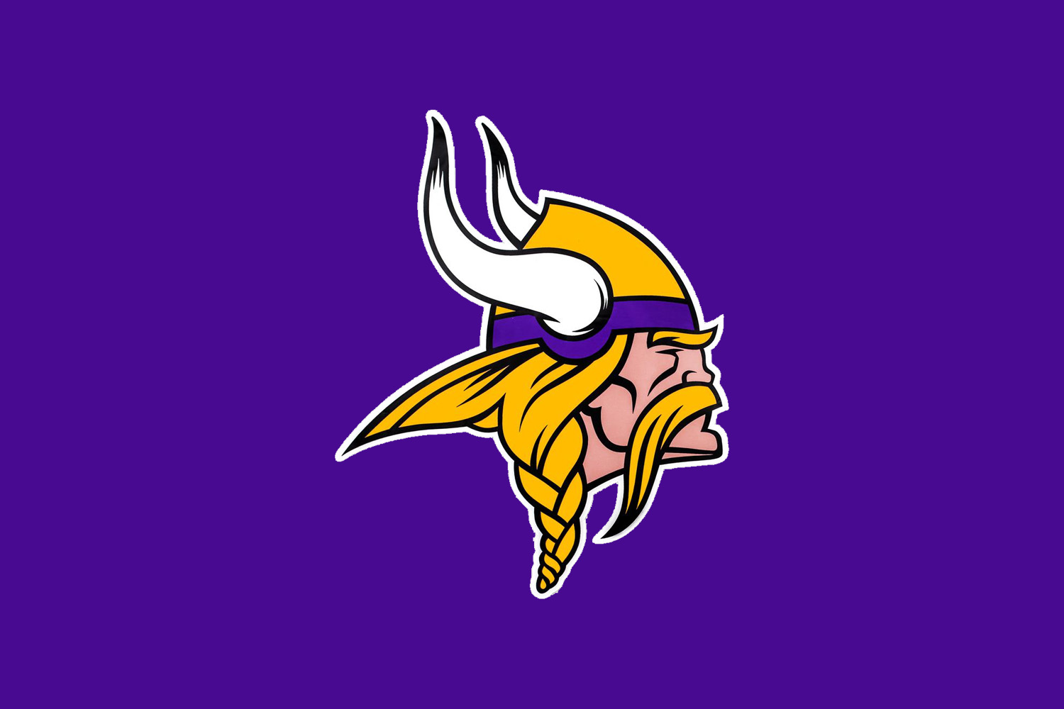
The Minnesota Vikings logo may not be the most modern of them, but strong lines and an “easy get” graphic makes for a classic and stoic aesthetic. Surprisingly, this version is fairly recent. Compared to the older Viking logo, this one has bolder lines that help the features stand out more and a subtle forward angle to help Mr. Viking Man seem more imposing. The black accents on the tips and base of the horns adds just enough dimension for a nice finishing touch.
NFC SOUTH WINNER: New Orlean Saints (2000 – present)
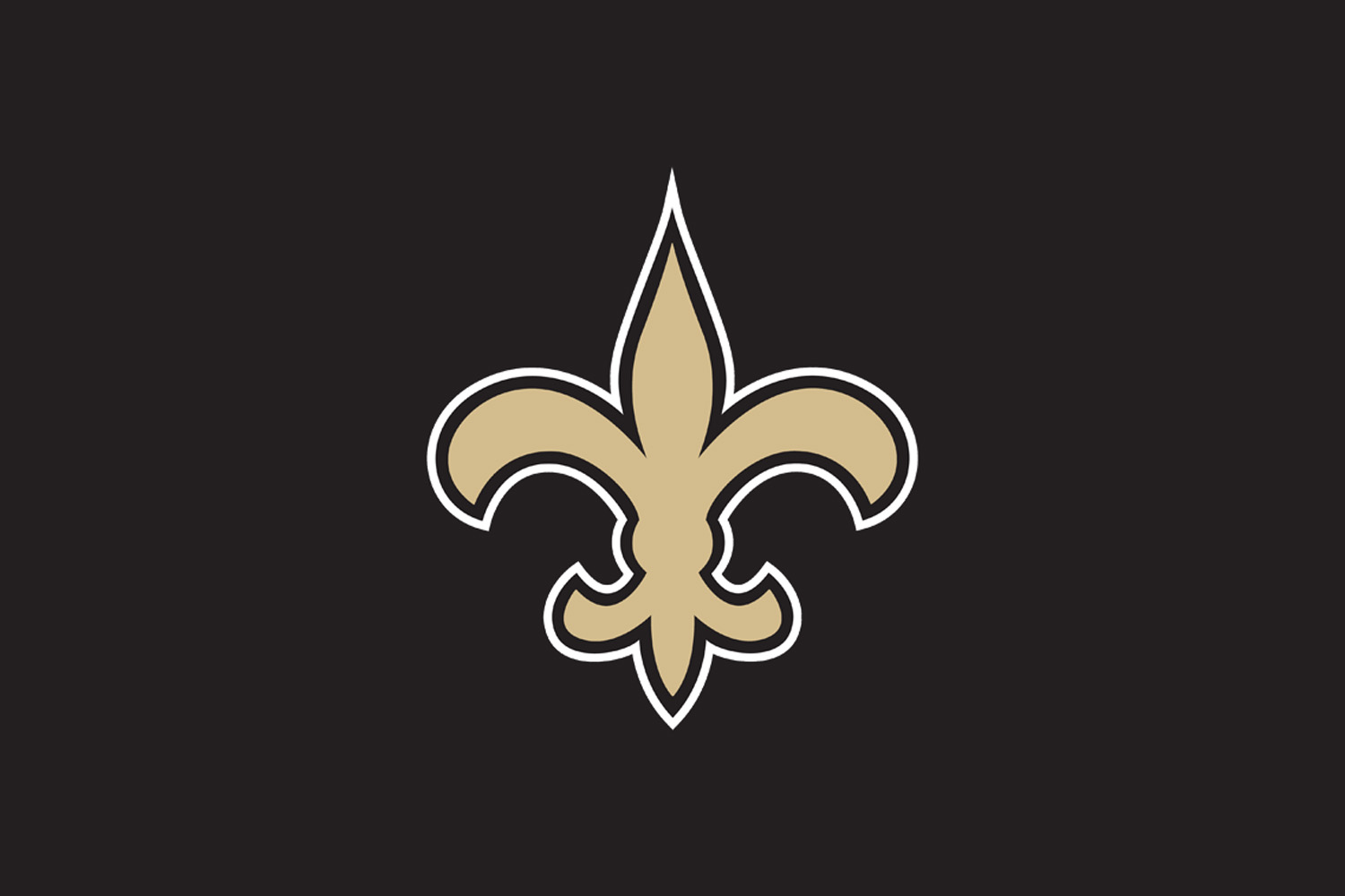
Utilizing the historic fleur-de-lis as their logo, the New Orlean Saints pay tribute to the rich heritage of the Big Easy. Striking the difficult balance of simple yet complex, this NFL logo is both recognizable and easy to scale. This makes it perfect for helmets, jerseys, fields, or bodies.
NFC SOUTH RUNNER-UP: Atlanta Falcons (2003 – present)
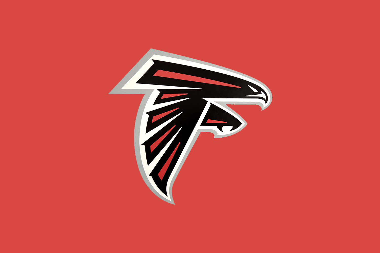
Another bird of prey, the Atlanta Falcons logo features the devilish combo of red and black as their primary colors. These two hues paired together can incite feelings of aggression and boldness. While the design is flat and is not the best example of showcasing a bird in flight, the designer did something that this writer secretly loves: they hid a “F” in the logo.
BEST OVERALL DIVISION: AFC South
WORST OVERALL DIVISION: NFC North
NFL LOGOS SUPER BOWL CONTENDERS: NEW ENGLAND PATRIOTS VS. HOUSTON TEXANS
Patriots versus Texans. We might as well call this the Battle of the Red, White, and Blue. Both logos beat out the competition with their modern takes on essentially the American flag. There’s the natural sense of movement, the excellent uses of negative space, and both logos are prime examples of simple design stripped down to the core message.
Who do you think would be the NFL Logos Super Bowl Champion?
Want to make a touchdown at work? Check out our ROI Calculator to see how much we can save your company.
Source link