[ad_1]
Whitespace. If you’re a designer, it’s the open landscape that lets your work breathe. If you’re a marketer, it’s the valuable real estate you want to stuff with offers, images, videos… the list goes on. And if you’re a consumer, it’s the negative space incorporated into the email or webpage you just opened. You might not even notice that it gives your eyes a place to rest, increases comprehension, and makes you more willing to listen to what marketers are trying to sell.
Why Whitespace Matters
Whitespace provides breathing room for the reader’s eye. Not only does it lend a modern design sensibility to you emails, but it creates an elegant, well-balanced feel that’s almost impossible to achieve with a cluttered layout. Here are a few benefits of whitespace:

-
Higher Comprehension: Studies show that whitespace increases reader comprehension by almost 20%.
-
Credibility: Research also shows that web users perceive a site’s credibility based on layout and design, consistency, typography, color, and frequency of updates. By spending time using whitespace well, you also increase the credibility of your company.
-
Guiding Your Reader: Whitespace can guide your reader’s eye from element to element, thereby establishing a reader funnel and leading your audience to the desired CTA.
-
Highlight CTAs: On that note, whitespace allows you to highlight CTAs and drive engagement. So if you’re tired of someone in BizDev asking you to “make the button bigger,” this can be a great way to increase attention without increasing size and throwing off the rest of your design.
-
Better Readability: We often think of white space as margins, gutters, or the space between images. It’s also important to include whitespace within your text sections to make it easier for your audience to read.
The Battle Over Whitespace
There’s an epic whitespace battle among creatives. A battle that makes GOT’s Targaryen’s vs. the Lannister’s look like an episode of Mr. Roger’s Neighborhood (minus the nudity and bloodshed).
A good marketer is always looking for one more opportunity to provide value to their readers. And a good designer will always fight to let their design deliver maximum impact. However, great creative teams will collaborate to ensure the copy and design don’t compete but work together to tell a memorable story.
So how do you achieve this kind of collaborative storytelling? Two ways!
-
Create teams — The more you can pair one designer and one copywriter or content marketer together, the more they will develop trust and a creative flow that results in more nuanced work. The best part? As their creative partnership develops, so will the quality of their work.
-
Encourage kick-off meetings — Design and copy should come together to discuss campaign goals and creative direction. And make sure that check-ins happen routinely throughout the process. Wrap things up with creative reviews before and after a campaign launch and make sure to talk about wins and weak points once results roll in.
-
Make sure everyone has access to your creative assets — The best way to nip tension in the bud? Ensure that everyone has the resources they need without having to hound their counterparts for logos, converted .png files, etc… The right Digital Asset Management (DAM) platform, like Brandfolder, will allow everyone in your company to access the right digital assets right when you need them. Collaborate on assets in your DAM, and kiss versioning headaches goodbye.
Now that we know the principles of whitespace, and how to form effective creative teams that will merge great design with effective content, let’s take a look at a few examples of companies making whitespace proud in email.
1. Moo
Moo is a UK-based business card and stationery supplier that’s made a name for itself with quippy copy and clean design. The company takes a modern, non-stuffy approach to a traditionally buttoned up genre.
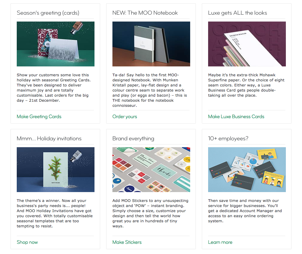
On their website, whitespace allows content-heavy areas to breathe and ensures that important product descriptions stand out.
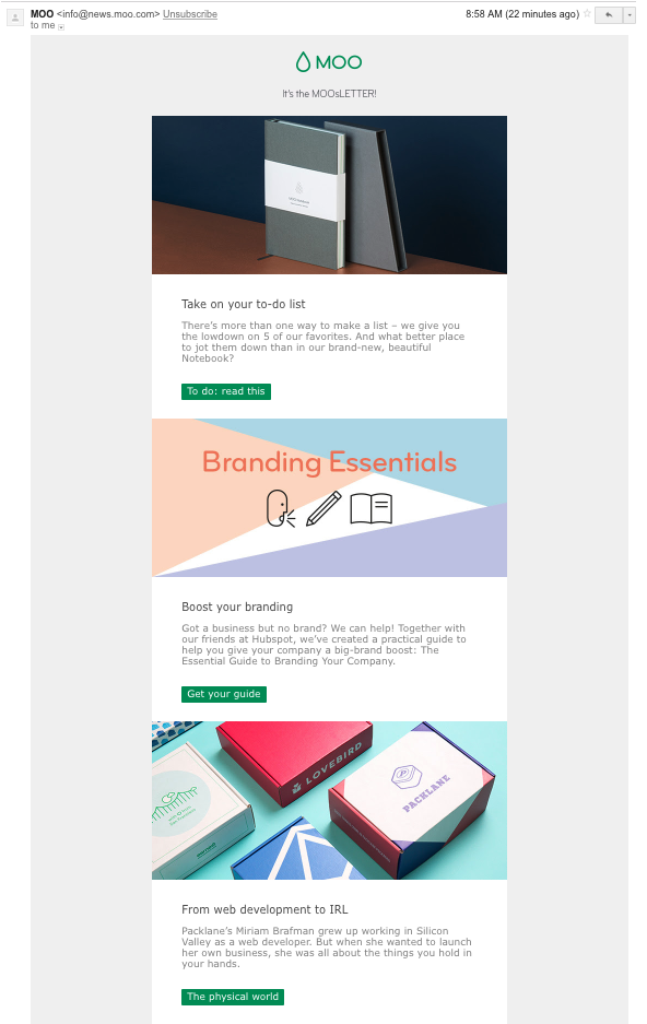
In their “MOOsLETTER, clean images, bright buttons, and, you guessed it, plenty of whitespace let their promoted content shine.
2. Wool and the Gang
Arguably the masters of whitespace, knitting purveyor Wool and the Gang incorporate it into almost every piece of marketing they create.
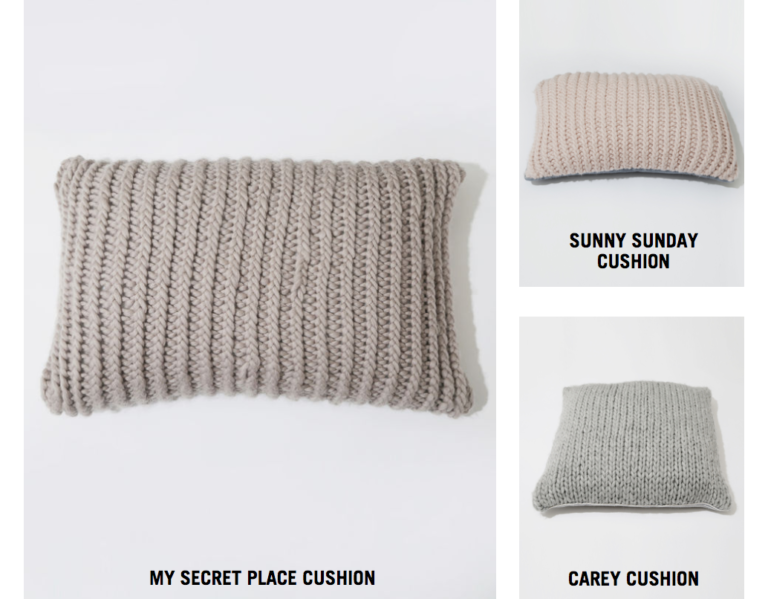
Products on their website are set against a plain white background that lets the texture of each product and “knit kit” stand out. It’s an excellent move, as texture is one of the biggest selling points for knitters.
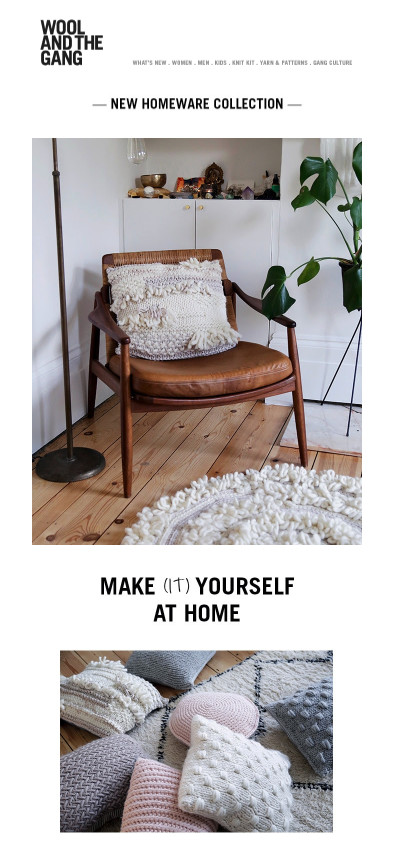
Their email design in no different. Minimal copy and fresh images are offset by white borders and minimal fuss or frills. The image is product-focused enough that it invites the click.
3. Velocity Partners
The first rule of marketing club is: you do not talk about marketing club. The second rule of marketing club is: you do not create emails with multiple paragraphs of copy and no images. Velocity Partners, a B2B marketing agency based in the UK, isn’t shy about their views on the deluge of “crap content” out there. That strong viewpoint is evident when you receive the rare email from them.
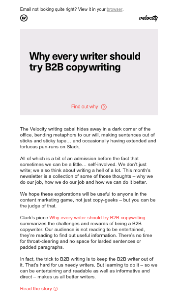
There are no images here to distract you, entertain you, or play to your emotions. If you’re intrigued by the content, you’ll keep reading. If you’re not, you probably won’t click through and you might even unsubscribe, and you know what, Velocity is OK with that.
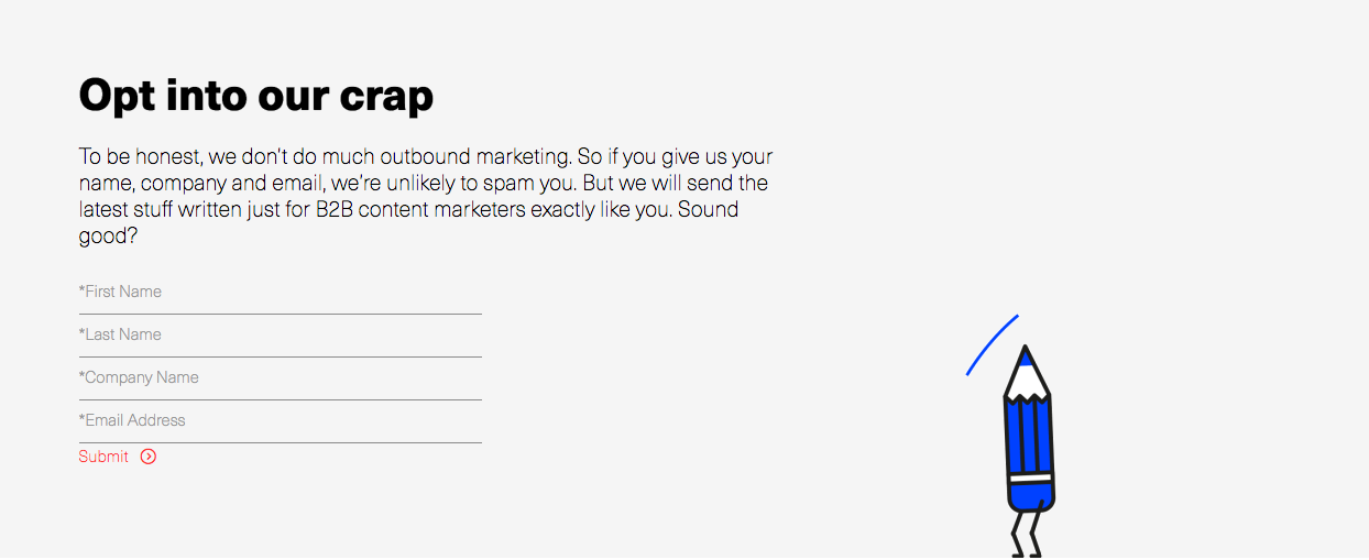
Their website boasts bold graphics, copy you’ll actually enjoy reading, and content that will make you a better marketer. Their confidence is evident and their design articulate.
4. Under Construction — Brand New
This Austin, Texas graphic design firm/duo produces several go-to blogs for creatives. My favorite is Brand New. When you first land on the homepage, it’s clear there’s a lot going on. But clever use of whitespace (and grayspace) ensures that your first thought is “Yippee! There’s a wealth of information here!” Instead of, “Where do I start and how soon can I leave?”
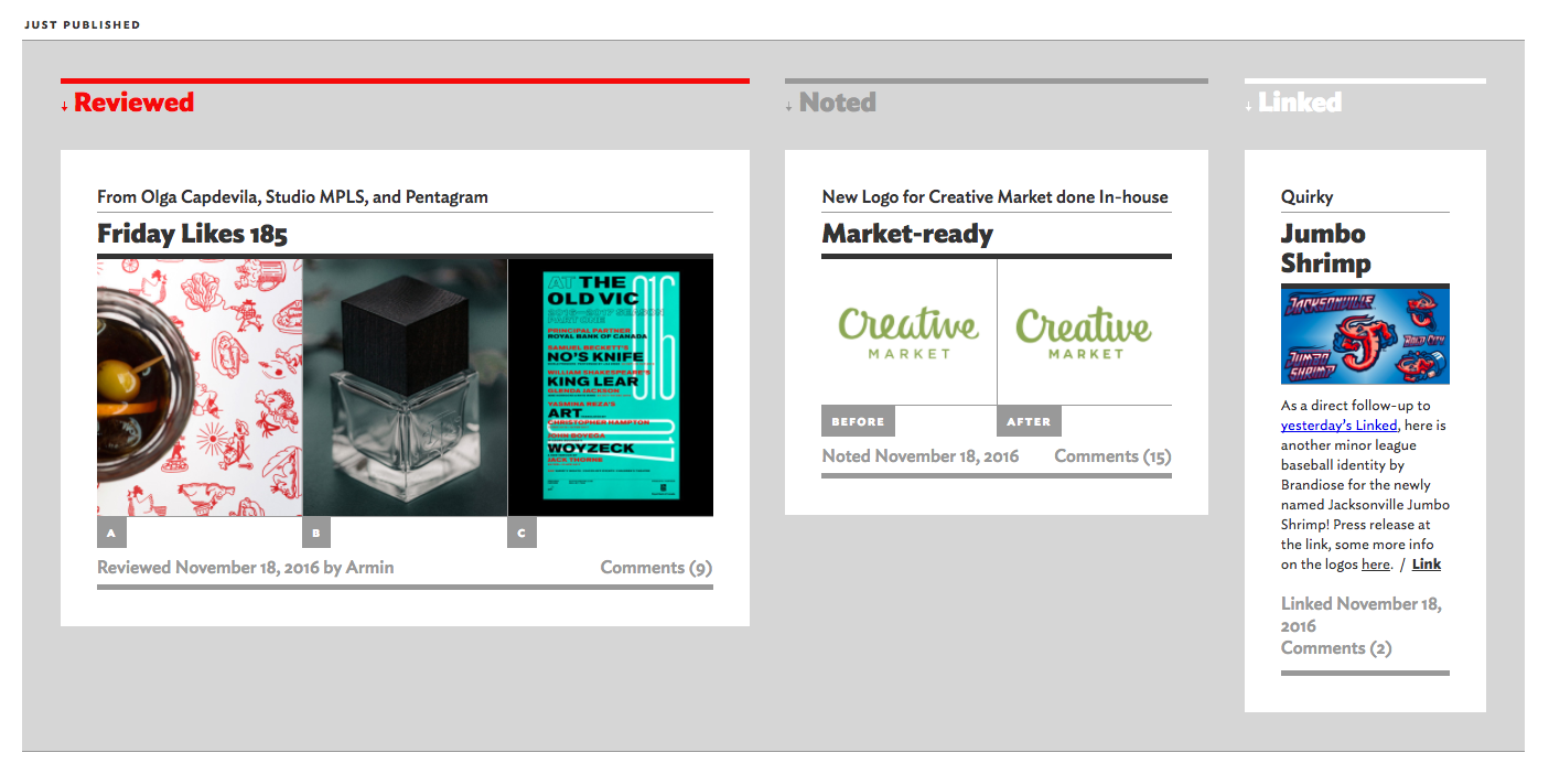
This site shares fresh corporate and brand identity work, which means when someone changes a logo or roles out a rebrand, the fine folks at Brand New are there to share and talk about it. There’s a lot of meat on this website, but everything is carefully placed and formatted to keep it clean and pleasing to the eye.
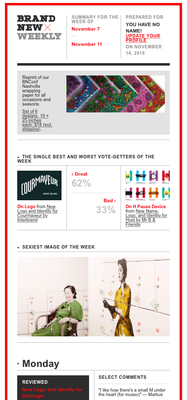
Brand New’s e-newsletter is another testament to the fact that whitespace doesn’t have to look minimalist to provide the same eye-pleasing benefits. They’re also fine curators of the scroll. 66% of audience attention and engagement happens below the fold, and Brand New makes the most of it, packing each email full of information.
5. J. Crew
This haven for preppy people is one of my favorite examples of whitespace. I think J. Crew kills the branding game across each of their channels, but that’s a post for another day. As far as whitespace goes, they use it generously and smartly.

Notice anything about the images on their Instagram page? 8 out of 9 feature whitespace prominently. The result is that the products in each image really pop. It’s noticeable enough when you’re scrolling through a feed packed with over-styled photos, but when you view them collectively, there’s a clear point of view being portrayed.
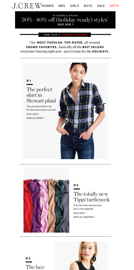
J. Crew gives email a good name. Above the fold, they feature a human, because as most marketers know, images featuring humans can hugely increase engagement and conversions. A numbered list guides the reader’s eye down the page to the inevitable CTA to buy. It’s subtle, it’s clean, and it’s sophisticated — kind of like J. Crew itself.
Takeaways
Don’t be afraid to take another look at your email templates. Could you give your design or copy a little breathing room? Your creative is probably great, so how can you let it work harder for your brand? Here are a few things to remember as you go forth and whitespace:
-
Use a DAM for increased collaboration between marketing and design. A DAM, like Brandfolder, allows designers and marketers to access the correct final assets, as well as assets still in flux. This allows everyone on a given project to see real time updates in one convenient location.
-
Don’t be afraid to let your images tell most of the story. By cutting back on copy and other design elements, you can let strong imagery make a powerful case for your product or service, without all the clutter.
-
If content is king for your company, let it be king! If you have a message you want to make sure your audience reads, highlight it with more subtle design and plenty of whitespace — and use images sparingly, if at all. It’s a bold move, but one that can pay off.
-
Use whitespace to guide the user’s eye to your CTA. When designing an email and incorporating copy, make sure you’re funneling your reader’s eye to just the right place. If the main event of your email or landing page is a gorgeous image, make sure that image is actionable by placing an easily identifiable CTA or message is nearby.
Want more great tips on how to harness your creativity and elevate the work you’re producing? Check out our Productivity eCourse for Creatives.
[ad_2]
Source link